17 Tips to Improve your eCommerce Checkout Page
Optimize your checkout process with trust badges, psychology, user intent, and the latest eCommerce plugins
Updated November 21, 2023.
Marketers often focus on the beginning of the marketing funnel - the awareness stage - and overlook the most important process on your eCommerce site, the checkout page. This is where your customers actually pay you for your product or service, and it’s a critical page to optimize for any eCommerce brand.
In fact, one of the most common reasons customers abandon their carts is because of a messy and overly complicated checkout process. According to a study from the Bamyard Institute, 28% of consumers surveyed stated that they abandon the checkout process because it was too long or complicated.
If you just simplify your checkout process, you can retain almost a third of your customers (ie get 28% more sales). Now that’s a recipe for success.
Ok so let’s cover the basics first, and then talk about some of the top tips to improve and simplify your checkout process.
But first, some definitions.
What is a checkout page?
A checkout page (or process) is the page or collection of pages where your user buys your actual product or service. It’s the equivalent of the cash register at a physical brick-and-mortar store.
Now, what’s the difference between a checkout page and a checkout process?
One-page vs multi-page checkout
Most brands have a checkout process with 3 or 4 steps and each step is a separate page. Some brands have combined all the steps and fit their entire checkout process into one single page.
Each type of checkout has its own pros and cons and both can be optimized. A one-page checkout page works really well on desktop devices, while a standard multi-page checkout process converts better on mobile phones.
Common checkout issues
Customers can have three basic issues with any checkout process:
- Friction - customers are turned off when they have to create an account or jump through a lot of loopholes.
- Time - customers leave your site if it takes too much time to check out.
- Cost - you can turn off some customers if you don’t display the estimated shipping costs upfront. If there is an added cost that they see at the end of the checkout process, they are more likely to abandon the site.
Marketers and eCommerce freelancers can work with designers to alleviate some of these problems.
Now, I know what you’re going to say. ”I’m using Shopify’s checkout process (fill in the blank whatever large eCommerce platform you’re using), so why do I need to change things?”.
And you may be right, if you are using a large eCommerce platform, and are a fairly small business then you shouldn’t have to upgrade to Shopify Plus and A/B testing the code (Trust me, don’t try this at home, use a Shopify expert).
But you can take a lot of these tips and use them to upgrade your eCommerce website, and improve your conversions and sales, on other pages. If you’re running a large eCommerce operation you may benefit from actually improving upon your platform’s default checkout process. Also, if you’re not using one of the main eCommerce platforms and instead have set up your own site using something like WordPress, then you definitely need to see some of these tips and continue optimizing your checkout flow.
Here are some of the best checkout pages we’ve seen of some of the most famous eCommerce brands.
We’re going to divide our list of checkout tips into 4 main categories. 1. Visual design 2. Price clarity 3. Mobile optimization 4. General setup
Let’s dive in.
Visual design
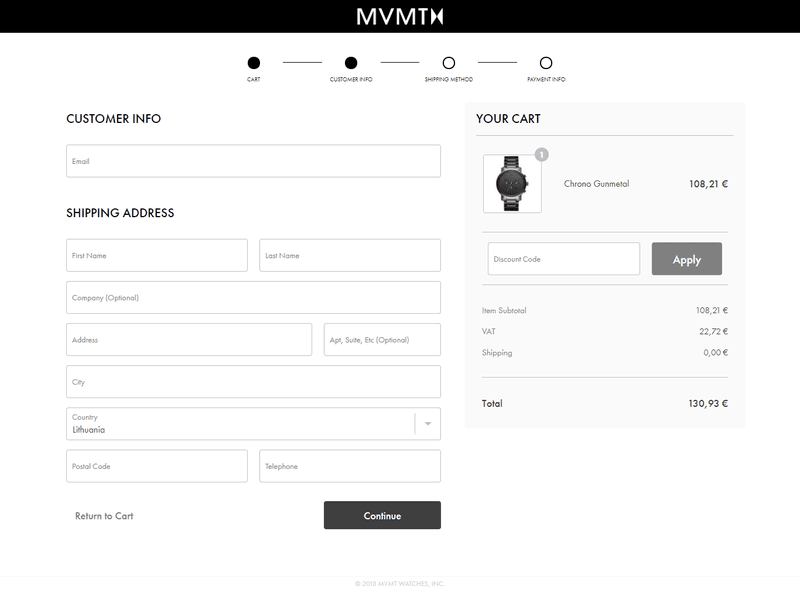
1. Display the outline of the checkout process visually
MVMT is one of the most iconic watch brands today. They provide a really great outline right above the checkout page, with the 4 basic steps of their checkout process. It gives the user clarity of what’s coming next and simplifies the whole process for them.
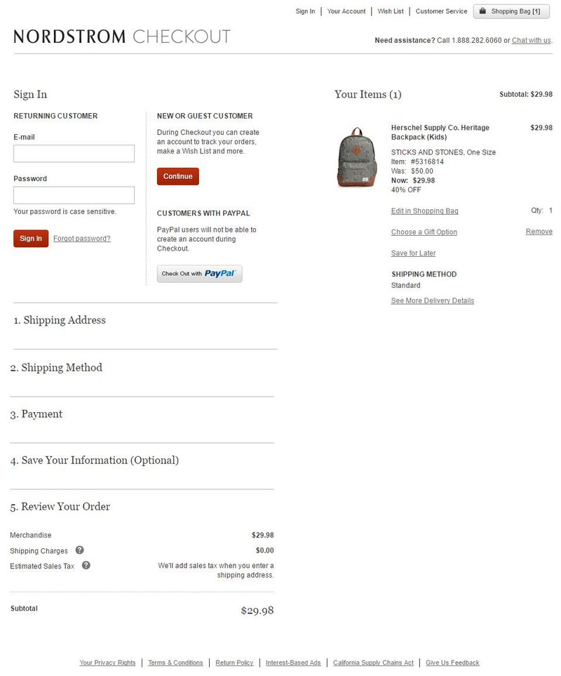
2. Display the entire checkout process on one page
Another great way to simplify the checkout process on one page. Nordstrom does this in a great way by presenting all the steps in an accordion menu. So as the user fills out the info, they scroll down and move on to the next element, instead of having to load another page.
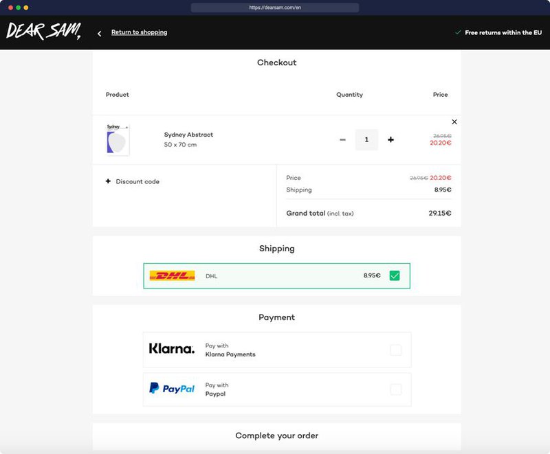
Here’s another example from DearSam, where every step of the checkout process is displayed on one single page.
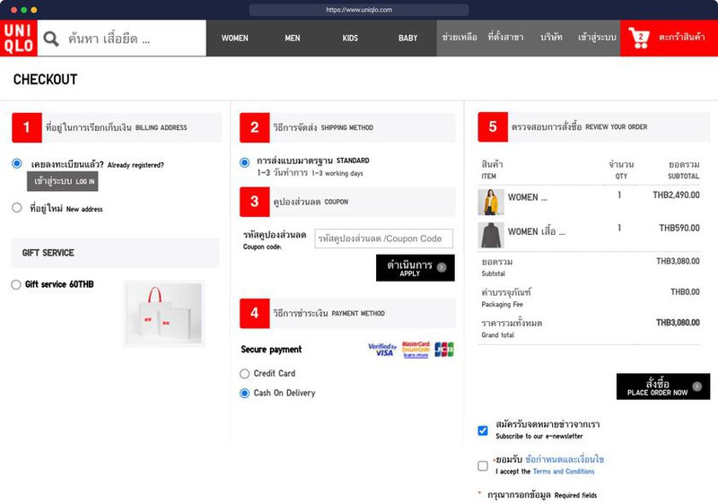
Here’s another example from Uniqlo Thailand, where they display it all horizontally.
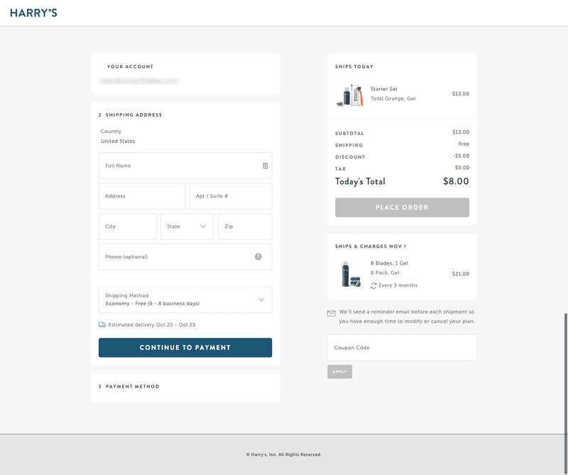
3. Remove the top menu
The goal of the checkout process/page should be to get a sale. You want to get the user to pay you money and get your product. You absolutely do not want them to go back and shop for more stuff, continue browsing, or leave the site altogether.
That’s why you should avoid displaying the top site menu on your checkout pages at all costs. Here’s a great example from Harry’s:
On the other hand, if your brand invests heavily in explaining your product and it involved some learning on the part of the user, then it might be to your advantage to display a simple menu in the checkout process. Here’s an example from the vitamin company Care/of:
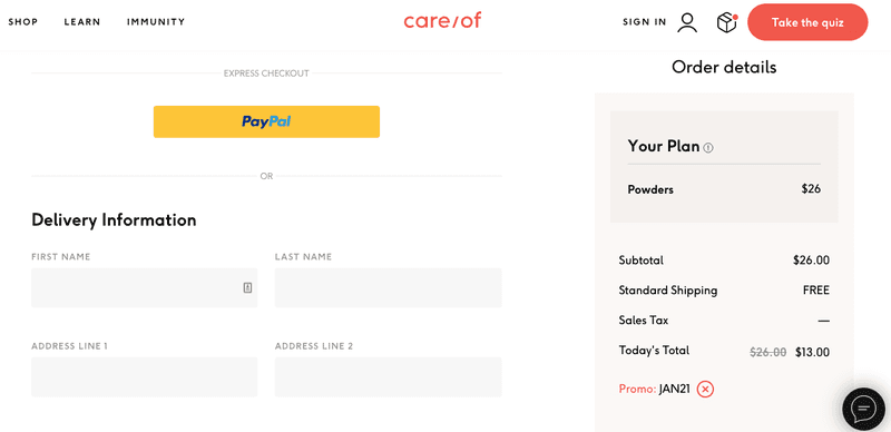
Notice how their menu only has 3 items on the left, and they retained their main CTA button “Take the quiz”. Their home page quiz is the shopping process because they do require some input from the user to help them select the right vitamins for them.
It’s a unique use case, but it may apply to some brands out there.
Price clarity tips
It’s super important that the user has clarity on all the charges that you’re going to slap them with. Frustration by extra charges is one of the main reasons that free shipping has become such a trend.
The user wants to know everything in advance because once they have an idea about the total, they don’t want to change it, and might actually abandon your site if you don’t satisfy their expectations.
That’s why you should display all of your charges ahead and early in the process. Here are some examples of how to do that.
4. Display all of your pricing on the product page
Here’s an example from Casper, the iconic mattress brand that became a recent unicorn (valued at $1B) in the home decor space. Here’s an example of their product page. Notice, how they display all of their charges before the user even gets to the checkout process.
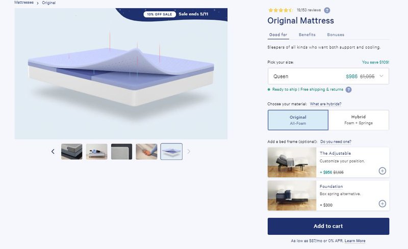
They display things like:
-Free shipping -Mattress sizes (product variants) -Bed frames (product upsells) -Other payment options
The user is crystal clear on what everything will cost and is that much more motivated to continue with the checkout process.
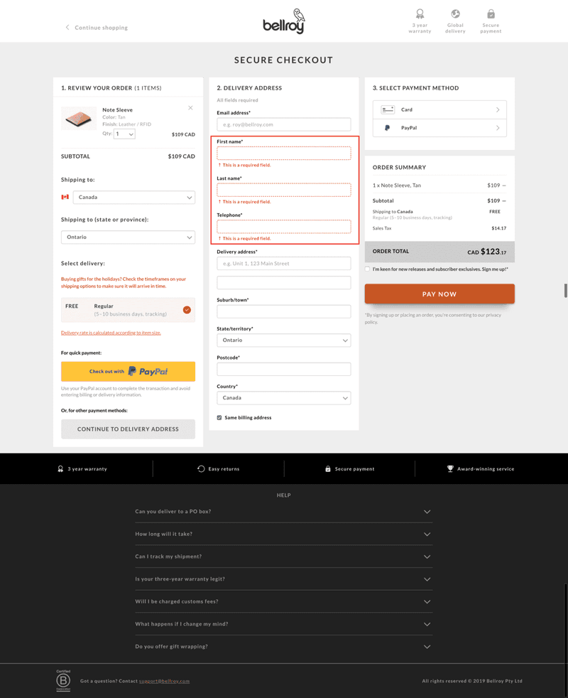
5. Summarize the cart and order details
Another great way to help the user have more clarity on pricing is to display an order summary. This is used to summarize everything they added to the cart, and to display the shipping charges. This is a great place to display your free shipping if you offer it.
Bellroy nailed it.
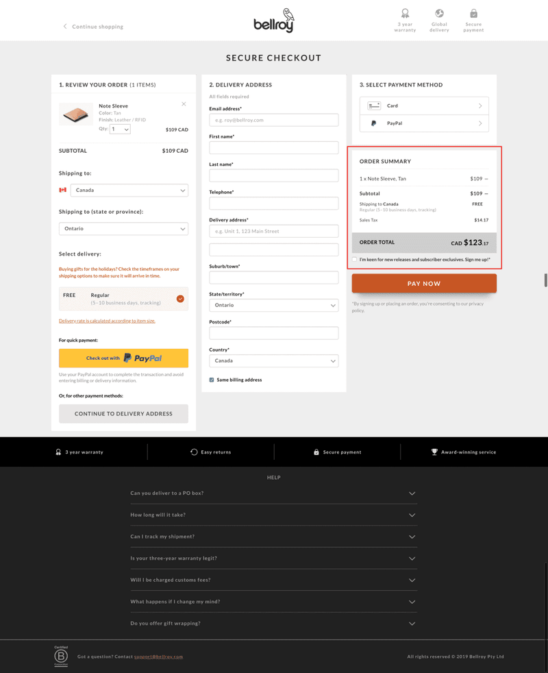
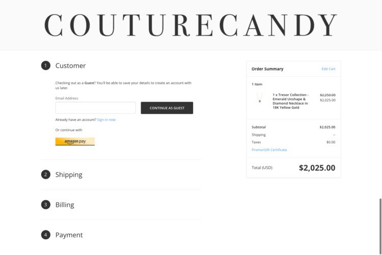
6. Make the order summary sticky
Make that order summary box move down the page as the user scrolls down the checkout. Here’s a great example from Couture Candy where you can see the user scrolled all the way down, and the order summary is still visible.
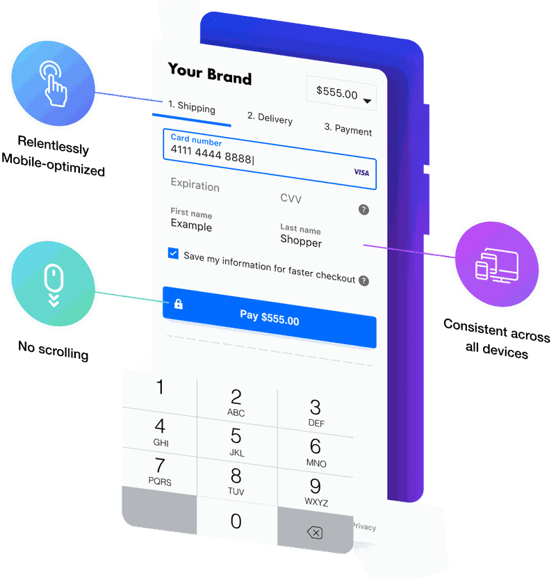
Mobile checkout best practices
Over 50% of online shoppers start shopping online on their mobile phones. So it’s really important that your checkout page is optimized for the mobile experience. There are a number of issues that mobile users can have. Common checkout issues on mobile: 1. Images are too big 2. Buttons are too small 3. The menu is too complicated and difficult to access
You need to avoid all of these in order to have a stellar mobile experience for your shoppers. Here are some of the best ways you could optimize your checkout for your mobile users.
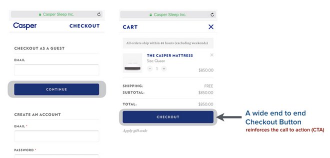
7. Display wide buttons
This one is a no-brainer.
Make all of your buttons wide, or end-to-end, to make them really easy to click. This will make your checkout process way easier to navigate on mobile.
8. Eliminate scrolling
Long pages are much easier to see on desktop than on mobile. The one thing that mobile users hate is having to scroll down on a page. It makes it really hard to navigate a page when you have to click in and out of buttons and then scroll down to see the next ones.
Make sure that your mobile checkout pages are as short as possible, even if that means making adding a step.
9. Use sticky menu & buttons
Ok, worst case scenario - you made your checkout pages too long for your mobile users. Don’t worry, you may not be able to fit everything on their tiny screen.
Time to course-correct.
Make your menus and buttons move down the screen as the user scrolls. It’s particularly impactful on mobile but you can use this tip for your desktop users as well.
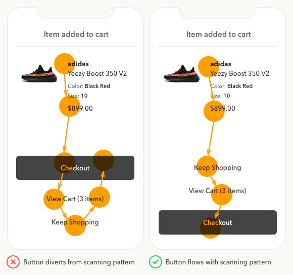
10. Place the checkout CTA last
Make sure that you place the CTA on the bottom of your mobile checkout. Even when you’re on the cart page, make sure that your button is the last thing that the users see, so that other things don’t divert their attention and take them away from purchasing your product.
General setup
Here are some general checkout page optimization tips that we couldn’t fit into any particular category. They range from the set up of the pages to the payment types, and everything in between.
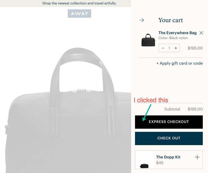
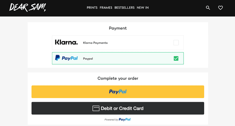
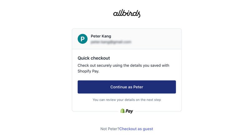
11. Offer 3rd party payment options
Make it as easy as possible for your users to check out by offering other payment options. One example is the Google Express checkout option. This lets the user select their saved payment method and literally checkout in seconds.
Here’s an example from Away:
There’s also Paypal - a really popular method of checking out, and Klarna - a way that provides the user to pay in small increments or installments.
Here’s an example from DearSam.
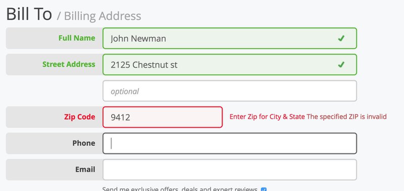
12. Display clear error notifications
One of the things that online shoppers hate most is getting an error message that they don’t know how to fix. “Gosh, what am I doing wrong here?” <- you don’t want this scenario to happen.
So, display error notifications clearly, make them red, make them stand out, and make the page automatically scroll to them if applicable.
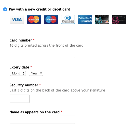
13. Use microcopy
Microcopy is that non-sales tiny print text that is used to explain something. Here is an example of microcopy in action on a checkout page. It may be a little over the top, but the explanation of where to find the card number and the security number on a credit card may help certain users convert.
14. Use inline form validation
Another great way to clarify the checkout process and help the user convert is to display the things that they are doing right. For example, once a user fills out a field correctly, mark it in green. This provides subconscious visual motivation to your user to continue the process.
15. Use a friendly color on the checkout buttons
Speaking of psychology, it’s important to use a friendly color on your checkout buttons. Don’t use red. Use a branded color or a nice black/green/blue to make it more appealing for the user to checkout.
Here’s an example from a standard Shopify checkout used by Allbirds:
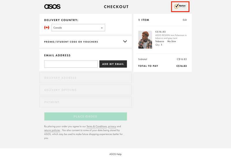
16. Display trust badges
This is a classic of checkout optimization that absolutely works. Display trust badges of all kinds whether that’s a secure checkout badge or a badge with some of your warranties and guarantees. It makes the user trust your site more and decreases their anxiety when checking out.
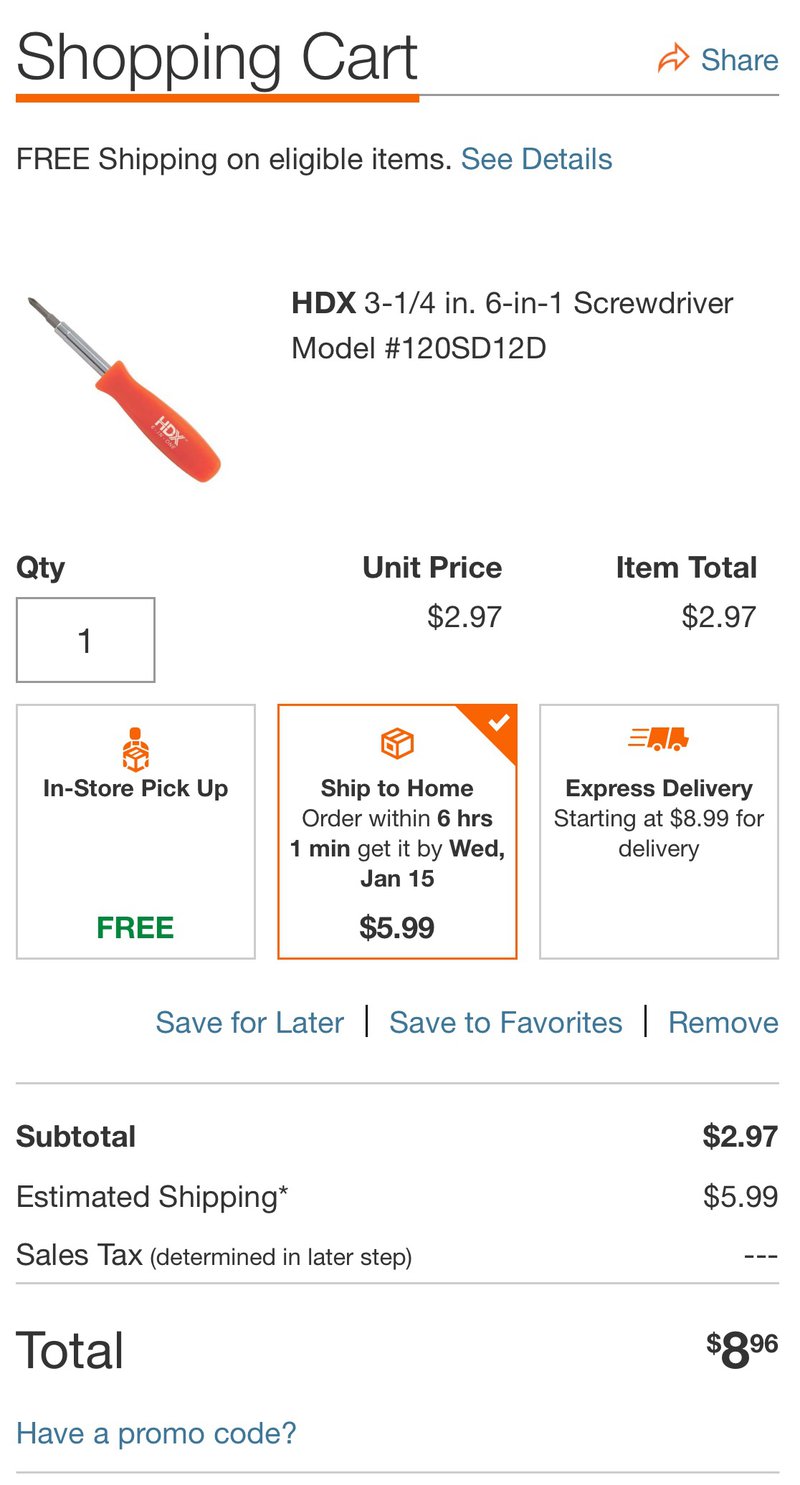
17. Display estimated time of delivery
A really good practice for checkout clarity is to display an estimated date when the customer will receive their product. This is especially powerful around the holidays when everyone is in a rush to get their presents in time.
A lot of the large online marketplaces are doing it (Amazon, Houzz, Etsy). And every small-medium eCommerce brand should do it as well. It gives that confidence and a large marketplace feel that users are looking for.
They want that clarity, so give it to them.
Here’s an example from HomeDepot:
Now that we talked about some of the best eCommerce checkout page tips, let’s discuss some of the top tools you could use to make your checkouts even better.
Top eCommerce checkout tools & plugins
Don’t have the budget to hire a developer for your checkout optimization? Not a problem, use one of these tools to set up these optimizations yourself.
1. One-Click Checkout by Sweet Ecom
This useful plugin helps you install a “buy now” button that takes the user from the product page straight into the checkout process. That means no more awkward shopping cart pages. Also, it has a feature that can animate your CTA buttons to help make them more visible. This is particularly useful when your product is more of an impulsive buy or when you have a lower average order value (AOV).
2. One-Click Checkout by SpurIT
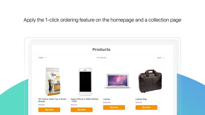
Here’s another great app that can help you offer a faster checkout experience for your shoppers. It is available on several of the main eCommerce platforms, and one unique feature is that it offers a checkout popup that brings users back to the checkout page.
You can also place “Buy Now” buttons on your home page and collection pages to bring users straight into the checkout process.
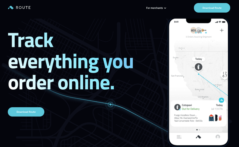
3. Route insurance
Route is a really unique tool that has several key advantages. First, it’s a shipping insurance provider so it protects your customers in case the order was damaged or lost in transit. It’s a badge you can add to your checkout page to improve customer trust.
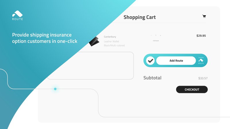
Another really cool feature is their visual tracking, where customers can see where their package is in real-time.
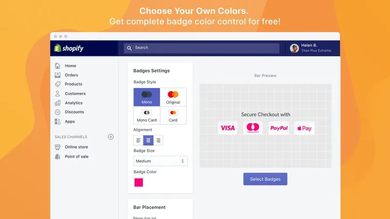
4. Ultimate Trust Badges by ConversionBear
This is the ultimate tool for creating trust badges for your site. Normally, you get these colorful badges and you’re stuck with their original color scheme. So a bunch of reds, blues, and purples, and they don’t really fit your site.
With this cool tool from ConversionBear, you can actually change the color of each logo you post on your checkout page, and it fits perfectly with your brand’s colors.
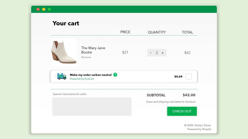
5. EcoCart
If your brand is about sustainability then this might be the tool for you. EcoCart is a plugin that provides a way for the shopper to pay extra to offset the carbon emissions of their purchase.
Sometimes a checkout optimization may not help your business grow. If your checkout is already optimized, or you just upgraded it and are not seeing the results you expected, it could be that another part of your funnel needs work.
So here’s a quick guide on how to work on the rest of your site conversions.
Optimize the rest of your site
Here are a few ways you could optimize the rest of your site, to increase your leads and sales.
1. Increase your traffic
It could be that you’re not getting enough traffic. In that case, you need to create more marketing channels or optimize existing ones to get more eyeballs on your content and product pages.
- Sell on more online marketplaces - look at places like Houzz, Amazon, Etsy, and eBay to get more sales. Research shows that many visitors that start their product search on these marketplaces end up buying on your site.
- Work with influencers - tap into existing audiences that are engaging and match your ideal customer personas.
- Ask your customers to create user-generated content (or UGC). You can do that by offering a giveaway or launching a contest, or just offering a discount for every piece of content they post.
- Invest in social ads (FB, IG, Pinterest), create more lookalike audiences, improve your retargeting campaigns (Google Display Network).
2. Optimize your collection and product pages
If your checkout is not getting enough action it might mean that your shoppers are having a hard time navigating your product or collection pages. Now is your chance to clean those up. Look at things like the layout, the images, the descriptions. Here are some important questions to ask yourself:
- Are your product page design & layout clear enough?
- Are your CTA’s clear and visible on your collection pages?
- Are your product pages cluttered?
- Do you display product reviews and customer images/videos?
- Do you display your phone number and contact info prominently on the site?
- Do you use trust badges?
Look at our ultimate guide to Conversion Rate Optimization to get the right tools and strategies for optimizing your entire site.
3. Refine your marketing strategy
If all else fails, it might be that you have to rethink your marketing strategy. It could be that you’ve been targeting the wrong audience, or your product positioning is wrong, or there have been some issues with your product that you haven’t uncovered yet.
Recap
Remember, your checkout is only the last piece of your marketing funnel. You definitely need to optimize it and make it as user-friendly and simple as possible. But you also need to look at your other pages and make sure that they are optimized as well.
And one of the best-kept secrets of conversion rate optimization is that your site should go through many iterations. You should run an A/B test on your checkout process and other parts of your site every 2-4 weeks. Use the data you get to create a new version and then test that one as well.