How Nectar Grew to $250M in 2 Years
Learn how Nectar grew from $0 to $250M in just 2 years with this brilliant one-page product page strategy. Conversion optimization + UGC + social proof.
Updated November 6, 2024
Here’s an incredible story of how data and A/B testing won the day. Nectar was a small home decor brand making mattresses. It was competing with some of the giants of the day - Casper, Purple, and others.
Nectar needed to stand out in a very competitive industry.
Luckily for them, they had some Google veterans on their team, that knew the power of collecting data and optimizing the conversion rate.
They started out with a regular product page - pictures + description + specs + CTA. They quickly realized that users land on their product pages and then leave to other areas on the site - such as “our story” and “about us” - to get the entire brand story. So they started A/B testing and ended up creating the 1 product page to rule them all.
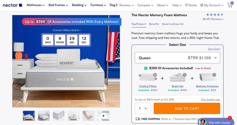
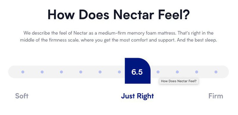
The new long-form product page has in it every section Nectar needed to convert their visitors, and it ended up improving their conversion rate to X. Here’s the top of their product page.
Notice that it has a nice countdown timer + an offer + “low in stock” (scarcity) + and a very visible CTA.
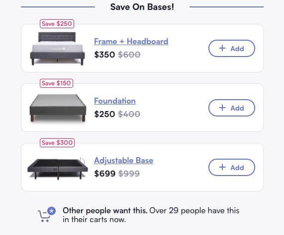
When you scroll down, only the right side of the page changes to a selection of bases (a great upsell opportunity).
Probably the first question that mattress shoppers ask themselves is - does it come with a base? And that’s the first thing they see when they start scrolling.
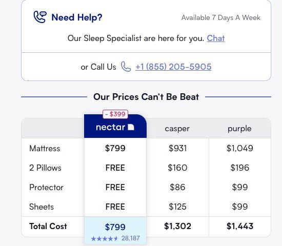
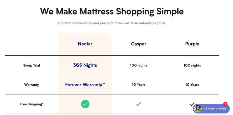
Next, you see their customer service phone number/chat and a quick price comparison with their competitors.
As you can see, they beat their competitors on price and every single feature.
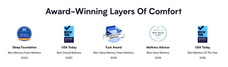
Next, they display all the awards that their products have received (social proof).
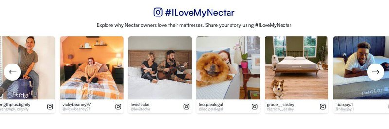
Then they display user-generated content (more social proof).
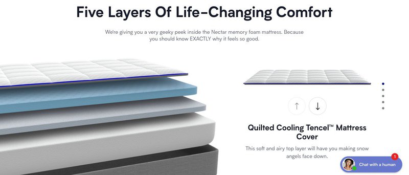
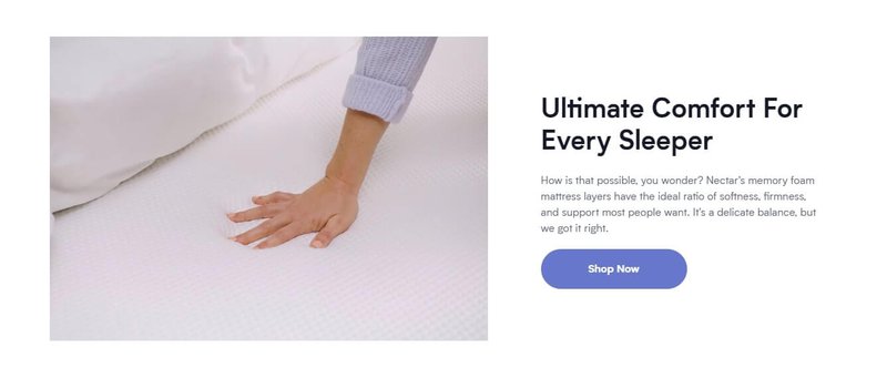
Then they explain how their product is made (the product story).
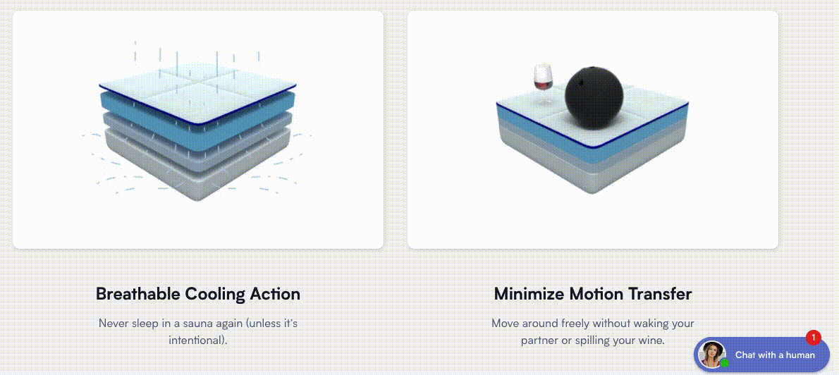
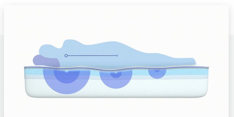
They also display 2 quick movies that beautifully illustrate the main features of the product.
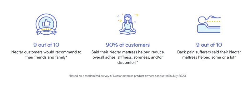
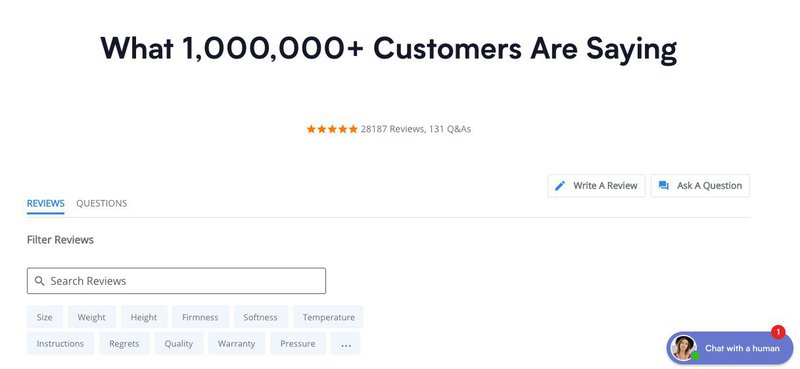
Then they show how much their customers LOVE their product.
Only then, do they get to the boring part of every product page - the product specs. Once the user is convinced that it’s a good product they usually look for the specs to make sure the dimensions fit their space. And this is where Nectar displays them.
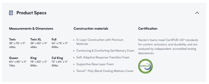
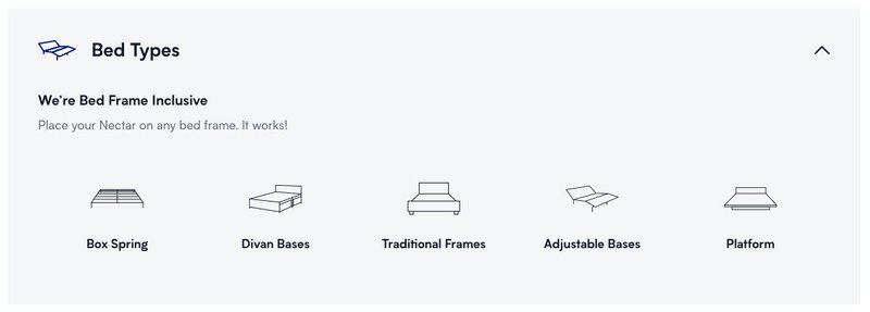
They also show that their mattresses fit all bed styles.
Then there’s another video with a CTA.
More product story.
And one more video.
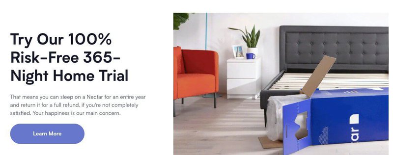
Then another image with a CTA, highlighting the longest trial in the history of home decor - a whopping 365 nights home trial.
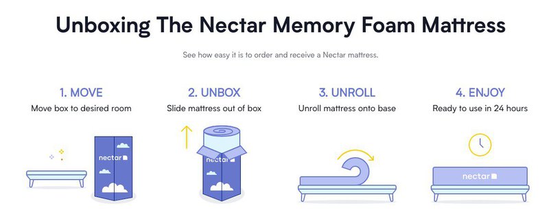
Then they display the instructions on how to unpack the mattress.
Notice, by this time the sticky menu on the top has changed to a much simpler version - the name of the product, # of reviews, price, and a CTA.
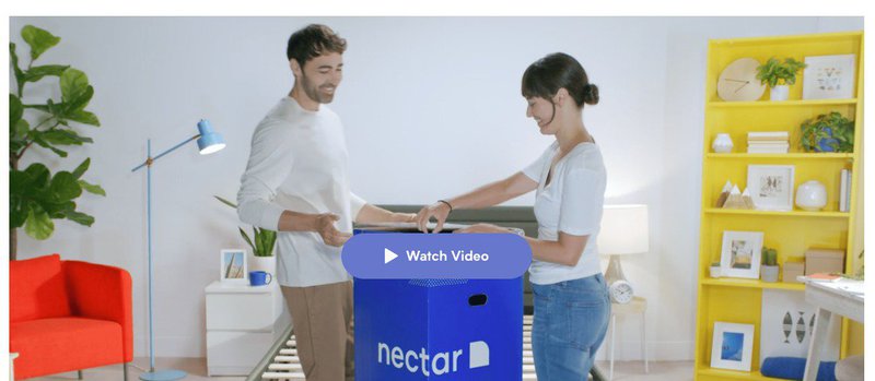
Then a longer 15-second video shows a couple unpacking the mattress and setting it up in their bedroom.
Then we get to see a fuller version of a competitor comparison table.
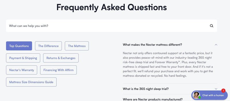
Finally, we get to the FAQs, which most brands place on top after the video and product description.
Notice that Nectar only put this element here after they got a chance to tell the full brand and product story and show the mattress in action.
And finally, there are customer reviews.
Nectar’s brilliant long-form product page consists of 19 elements, beautifully executed, and rigorously A/B tested.
To recap, all of these elements combined together vastly improve Nectar’s conversion rate because they answer all if not most customer objections about the product and provide really great CTAs throughout the page. And the best part - the company changes the sequence of these elements through A/B tests and advanced customer segmentation.
Want to improve your eCommerce conversion rate? Want to hire a CRO expert or an A/B testing specialist to help you improve? Get started with Mayple today.