The Ultimate Guide to eCommerce CRO
Here's how you optimize your site to get more conversions. We cover popups, exit-intent strategies and much more.
Published November 5, 2024

Most eCommerce businesses experience a few good marketing wins and then they get stuck.
And their first reaction is - what are we missing? Is there a new channel that we should explore? Perhaps another eCommerce expert that we should hire? Maybe you’re stuck in the same situation.
Sometimes it’s not a matter of expanding to new channels and throwing more money into ads, but you should do is optimize existing channels first. And that starts with your own site.
Before you start chasing new and better channels (which is important by the way) we urge you to look at your site’s conversion rate. Perhaps there are tools, plugins or design modifications that you could make to dramatically improve your site conversion, as part of your wider digital marketing strategy.
And improving your conversion helps all of your marketing channels, whether that’s PPC, SEO, affiliates, influencers, social media, you name it.
Conversion rate optimization (CRO) has been around since the early 2000s and it’s an incredible way to improve everything you are doing in your eCommerce store.
In this guide, we are going to show you exactly how to go about doing all of that.
We’re going to cover the right strategies, tools, and eCommerce platforms that you will need to boost your conversions.
Let’s dive in.
What is eCommerce CRO?
Conversation rate optimization or CRO is the process of optimizing your eCommerce website to increase sales. This is done through a variety of strategies including optimizing the checkout process, improving your product pages, and adding more popups and CTAs throughout your site.
Why should you invest in conversion rate optimization?
We’ve talked about this a little bit and I want to show you how focusing on conversion rate optimization can help your business.
Let’s say you sell shoes and your average order value (AOV) is $100. You get 20,000 unique visitors to your site every month, and your conversion rate is 1%.
So how many customers would you have on average every month?
Paying customers (conversions) = 20,000 * 0.01 = 200
Revenue = 200 * $100 = $20,000
So let’s say you have a Google Ads expert on your team and he is responsible for bringing you 50% of your traffic. That means that he is bringing $10k in sales every month or half of your total revenue.
What if you could increase your 1% conversion rate to 2%?
Let’s do the math.
Paying customers (conversions) = 20,000 * 0.02 = 400
Revenue = 400 * $100 = $40,000
Improving your conversion rate just doubled your sales. Your PPC guy is looking amazing because his sales just doubled as well, and Google is giving him a priority and better placement (because of the higher conversion rate).
You’re happy because you’re making more money. You now have the funds to hire a full-time social media manager and grow your brand.
The benefits of investing in conversion rate optimization
Here are 3 benefits of investing in CRO:
-Improves the bottom line -Improves the sales and efficiency of multiple marketing channels at once -Empowers your marketing team and saves costs
So how do improve your conversion rate? By using data.
How to increase your eCommerce conversion rate
Analyze your data
All conversion rate optimization campaigns have to be based on data.
If you don’t know what your users are doing on your site, and if you don’t know your current conversion rate, then how would you know if you’ve improved it? Also, once you make a change, how would you know whether it helped or hurt your conversions?
Every step of a CRO campaign has to be based on the data to have a positive impact on your bottom line. And this is really how the top eCommerce brands make decisions.
Now, I wish that doubling your conversion rate was as easy as writing about it. It’s a difficult and often complex process but we’re going to break it up into tiny bite-sized chunks and present you with some amazing tools that will help you simplify the process even more.
Before we do that, there’s one type of problem that CRO won’t solve - if you’re not getting enough traction at the top of the marketing funnel.
Focus on the top of the funnel first
If you’re not getting enough traffic to your site then your conversions won’t do much for you.
So the first thing you need to do is to make sure that your top of the funnel is set up - that you are acquiring traffic and that enough of your visitors are reaching your category and product pages. If you don’t have that many visitors going through your funnel then CRO efforts won’t do much for you.
For example, if 90% of your sales are coming from Amazon/eBay/Wayfair, and your site presence is very small then you should work on growing your brand and acquiring more traffic before you venture into CRO.
Improve your category pages
- Display user reviews on each category page
- Include UGC, influencer shots, and videos
- Simplify your navigation menu & navigation options within each category
- Avoid sidebar navigation
Improve your product pages
- Use engaging product images
- Display user-generated photos & videos from your customers and influencers
- Display a product video as the primary product image
- Display a “certified” badge on your primary product image
- Display product reviews for each product
- Pack your product description with useful info
Reduce shopping cart abandonment
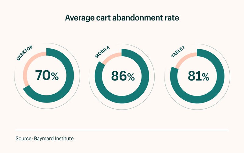
Once you optimize the top of the funnel it’s time to look at your cart abandonment rate. How many potential customers add something to their shopping cart and then leave before making the purchase?
Studies show that the average cart abandonment rate is 68.81% and it definitely varies by industry/niche. And here it is broken down by the device used:
Look at the cart page and checkout process and see what you can improve there. Start with the add-to-cart button and the cart page and then work your way through the checkout process and see what you could simplify.
Use heat maps to see aggregate data on where users click and what catches their eye the most.
Improve your add-to-cart rate
- Display limited-time offers
- Use dynamic notifications (”Megan just bought X product 2 hours ago”)
- Use scarcity notifications (”Only 5 left of this product”)
- Decrease the load time on all of your pages
- Display trust banners and credit card logos
- Display your warranties and certifications as trust signals
- Display shipping cost before the cart page
Improve the checkout experience
- Simplify your checkout navigation menu
- Simplify shipping options
- Remove any unnecessary fields
Focus on the user experience
Look at the entire process from when a user lands on your site all the way through checkout and see what you can improve on.
Now that we’ve got that out of the way, how do you go about it improving your conversion?
How to set up an A/B test in 3 easy steps
There are three basic steps to any CRO campaign:
1. Set a goal and design your test
Once you have the data you need on the specific page or part of the marketing funnel that you want to optimize it’s time to create an A/B test. You will need to use software for that like Google Optimizer or Optimizely or another alternative (we will talk about this later in the article).
2. Run the A/B test
Now it’s time to run the A/B test. When you launch it, make sure that you give it enough time to gather enough data and this again depends on the traffic that your site gets.
3. Analyze the results & continue testing
Don’t give up or get discouraged if the variation that you made was a failure. A/B testing is all about learning and now you have more data about your visitors so create the next iteration and test again.
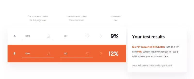
How do you check if the A/B test results are significant enough? Use an A/B testing calculator.
If you don’t get significant results you might not have identified the correct customer pain point. In this case, you need to go back to the drawing board and the customer journey map and see if there is a larger issue you could tackle.
For example, maybe you were testing your product pages while your customers are getting stuck on the category page. So you would need to go back and optimize the category pages first, before going down the funnel.
If you want to learn more about setting up A/B tests correctly and using data for design decisions, read up on agile methodology and growth-driven design. Here’s a really great in-depth video from Hubspot that goes through a lot of the concepts you need to know:
Now that you know how to set up an A/B test let’s talk about all the various strategies that the top brands and marketers are using to improve their conversions.
21 ways to boost your eCommerce conversion rate
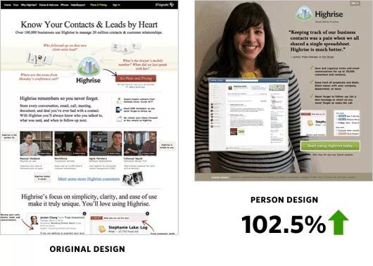
1. Add pictures of people
This sounds like a no-brainer but so many companies still have these homepages without any people or faces on them. Faces of people have been proven to increase conversions. In one study, 37Signals added a person’s picture to their home page and it increased their signups by 102.5%.
2. Use psychological validation
One amazing psychological principle that makes the user more likely to convert is validation. Airbnb uses this really well. They validate the password field when a user puts in a strong password and the other fields turn green when the user puts in their information.

This seems like a really simple change but it’s become part of Airbnb’s overall CRO and UX strategy.
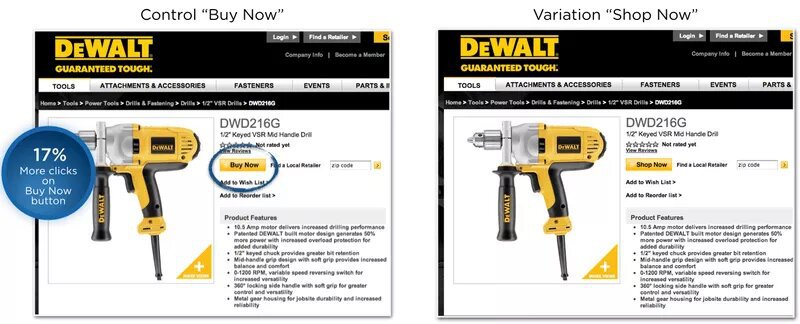
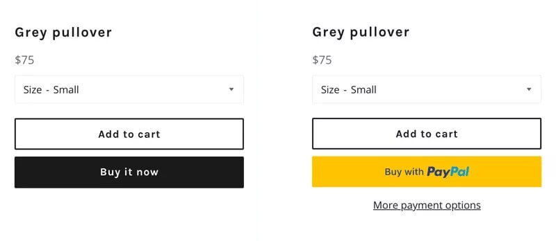
3. Experiment with the CTA button text
The click-to-action button on your site is probably the most important element you need to optimize. There are several standard CTA buttons that we’re going to cover. First, there’s the classic case study from Dewalt where they tried changing the button text from “Buy Now” to “Shop Now”. This one small change resulted in 17% more clicks.
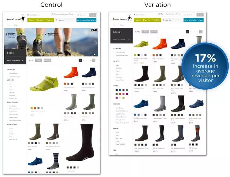
4. Experiment with your grid layout
One critical element of your site is the layout you use for your category pages. It seems like a trivial thing, who cares if I display three products in each row or four? That’s what Smartwool thought too until they tested this out.
Their control version had one product displayed larger than all the rest. For their variation, they created a standard grid and made all the products the same size. This small change has led to an increase of 17% in average revenue per visitor.
5. Optimize your site for mobile
I can’t tell you guys enough how many sites I see that completely ignore their mobile users. Studies show that 54% of all eCommerce sales are coming from mobile users. So it’s imperative that you not only make your site responsive but also test your site on all possible devices (desktop, mobile, tablet) and make sure that everything looks good.
6. Add filters to product category pages
The users that have the highest purchase intent often use the site search to find exactly what they are looking for. Make it easier for them to use by adding more filters such as featured, new arrivals, most popular, $$$, A-Z, or highest rated.
7. Use exit-intent popups
Popups are an amazing tool to convert your site visitors to leads and what’s even more powerful is to use exit popups. These popups display right when a visitor is about to exit your site and they have proven to be even more effective.

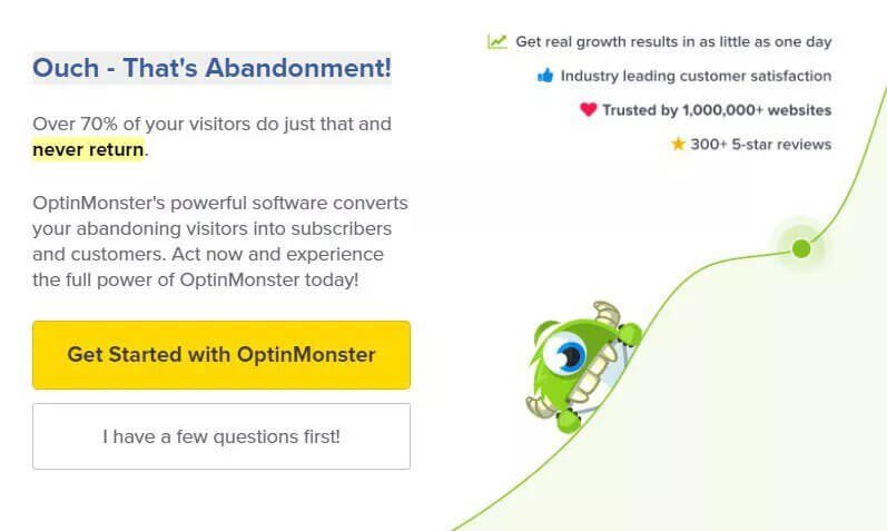
8. Get creative with the “no” button on your popup
There’s no reason to leave the boring Yes and No options on your popup. One option is to make the no button something like “I hate getting more leads” which is a psychological trick that may or may not resonate well with your audience.
But there’s a softer and better way to grab your customer's attention.
The reality is that someone is abandoning your site because they haven’t found what they were looking for. And you can find a way to provide them with more information about your product in a creative way.
Optinmonster does this really well.
Here’s an example of one of their exit popups. Notice how they removed the “no” option completely. Their button says “I have a few questions first!” and leads the user to their “contact us” page.
9. Upgrade your site chat
The basic functionality of site chat widgets is just that - the ability to chat with your customers and site visitors. But marketers know that chat is much more useful than that.

If you use a customer chat widget from Recart then you can turn this into a whole new marketing channel. This would connect to Messenger as well and once a visitor clicks on that prompt about discounts, they automatically subscribe to your Messenger list.
10. Show customer reviews visually
We’ve already spoken about UGC tools in this article but they are so cool we’re going to mention them a second time. Brands are seeing crazy improvements in their site conversions by displaying their customer photos. Studies show that 88% of consumers take peer reviews into consideration.
The clothing brand Leonisa started using Pixlee for their UGC which lead to site visitors being 1.85x more likely after interacting with the UGC images, spending 46% more time on the site, and being 273% more likely to return and purchase again.
11. Offer alternative payment methods
Make your customer’s checkout process easier by offering alternative payment methods. These could include Google Play, Apple Pay, Paypal, and other e-wallets.
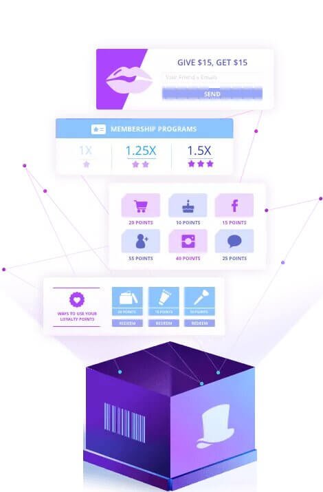
12. Launch a referral program
Referral programs are a way to encourage and monetize word-of-mouth and improve your site traffic. Use an easy tool like Swell Rewards to quickly launch a referral program on a Shopify, Magento, or BigCommerce site.
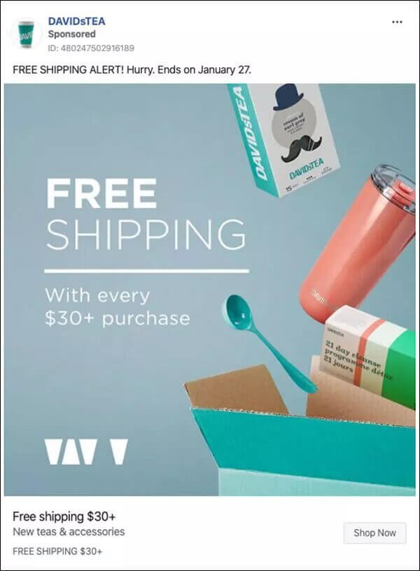
13. Offer Free Shipping
Free shipping is not just a fad, it’s actually a really powerful way to increase your conversions. Studies show that 79% of US consumers say that free shipping would make them more likely to purchase online, and 54% of US consumers under the age of 25 years said that same-day shipping is their number one purchase driver.
Considering the fact that 35% of the US are Millenials, and more than half of them prioritize same-day shipping right at the top, it’s no wonder that Amazon is the largest online marketplace in the US.
79% of US consumers say that free shipping would make them more likely to purchase online.
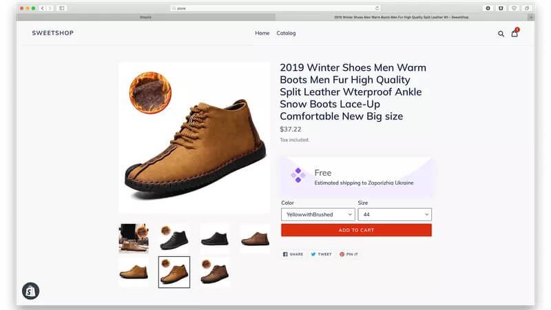
14. Display shipping cost early to increase trust
One of the biggest rookie mistakes in the eCommerce world is offering a really good price on a product, and then displaying the extra shipping charges at the very end of the checkout process. Studies show that 21% of shoppers get turned off and leave online shops because of this mistake. So don’t disappoint 1/5th of your online shoppers and display an “estimated shipping” cost early in the checkout process, even on the product page if possible.
21% of online shoppers abandoned orders because the total cost of their purchase wasn’t displayed before they started the checkout process.
15. Personalize your content for each user
Imagine you go to 2 different shoe stores to get a pair of sneakers. The first store is far from home and you don’t know the people working there. The second store is closer to your house and the person on staff that day turns out to be a classmate of yours from Highschool.
Which store would you buy from? You are more likely to buy from the second store because you know someone there. And no, it’s not because you want to be nice and help him out. A buying decision is often emotional, so that recognition and personalized experience sway you towards making the purchase.
Studies show that 49% of buyers have made impulse purchases after receiving a personalized experience. That's a lot more conversions!
16. Let your users create a wishlist
This tactic ties in really nicely with personalization. Make it possible for your users to add items to their wishlists. And then send them reminders about those items that they added to the list. This is a great opportunity to get more data on your users’ preferences, to retarget them, engage them in your site more, and use their wishlist as a form of social proof.
Etsy does this really well.
Here’s an example of a wishlist from an Etsy user.
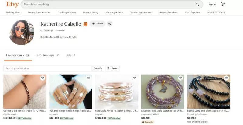
The user clicks on the little heart icon to save an item into their wishlist.
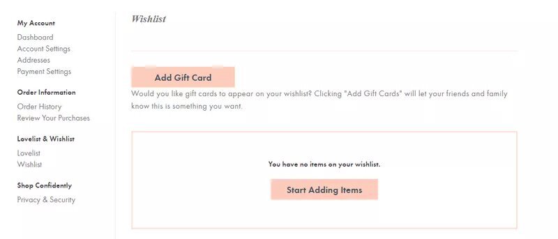
ModCloth takes this a step further.
They not only display the wishlist option, as Etsy does, but they also display the total number of people that liked the product.
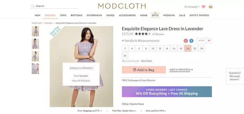
And the user can also share their wishlist with their friends and family and add a gift card option to it, to get a gift for their birthday.
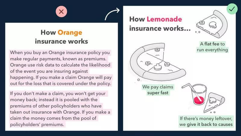
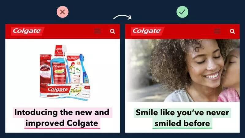
17. Display your content visually
This is one of the principles of copywriting. And Donald Miller said it best - “Imagine every time you talk about your product, your customer starts running on a treadmill. Don’t expect them to burn too many calories”.
Don’t make your customers work harder than they have to.
Here’s an example of how Lemonade, the $1B insurance startup, used this principle:
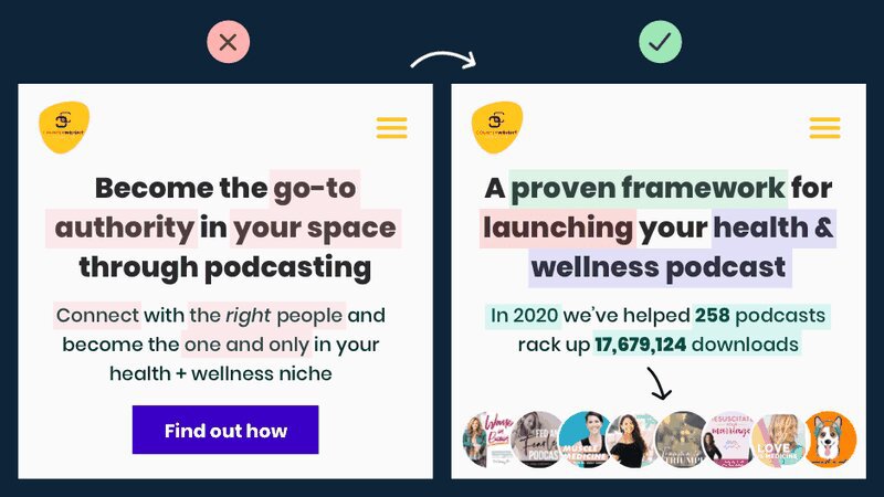
18. Focus on the value your product brings
So many companies fill up their web copy with product descriptions that focus on the many features, all the bells, and whistles, instead of focusing on the customer.
Remember, your customer is the most important person in the room. You need to show them how your product benefits them, and talk about the result.
Here’s a great example of this in action.
Notice on the left, everything is about the product. On the right, it’s all about the customer.
19. Display social proof
One of the greatest things you could do is to let your customers speak for you. That means displaying testimonials, reviews, UGC.
But sometimes it’s as easy as mentioning who your customers are.
Here’s a great example of a wellness podcast:
Here’s another example from Socios.com These guys actually work with some of the top soccer clubs in the world. See how much more powerful their page becomes when they add those club logos.
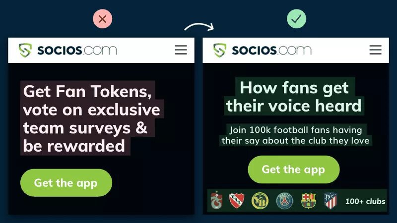
Social proof is by far the easiest way to set your landing page copy apart from the competition.
For more tips on how to use social proof check out our guide to user-generated content.
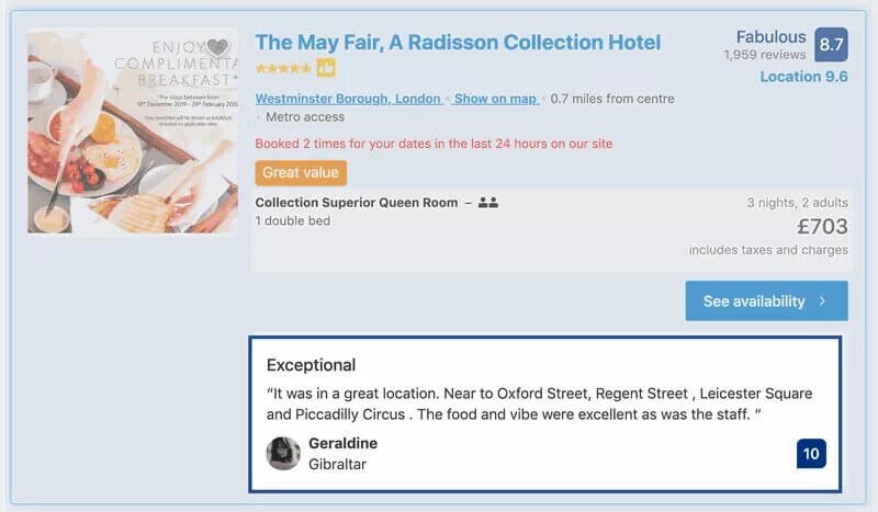
20. Display customer testimonials
We’ve already spoken about elevating the social proof up the page, and where this is most powerful is on your product pages.
Bring those customer testimonials to be right under the product headline, before the description with all your keywords.
Here’s an example from Booking.com.
21. Educate with long-form content
Seriously, we can’t talk about this enough. You can get way more impressions and traffic if you go from regular seller to educator. Seek to educate your readers and offer value for free.
Example 1: River Pools. River Pools was a swimming pool business on the brink of collapse back in the 2008 recession. They cut their entire marketing budget and started writing blog posts to answer every single customer question they got.
They went from 0 to 300k monthly visitors on the site and were able to save their business.

Example 2: Viral loops
Viral Loops started out as a humble referral widget that lets people get more referrals and grow their email list. But then they started cranking out this really high-quality content and telling incredible stories - like the story of how Harry’s got 100,000 email subscribers in 1 week - and they became an authority on referral marketing.
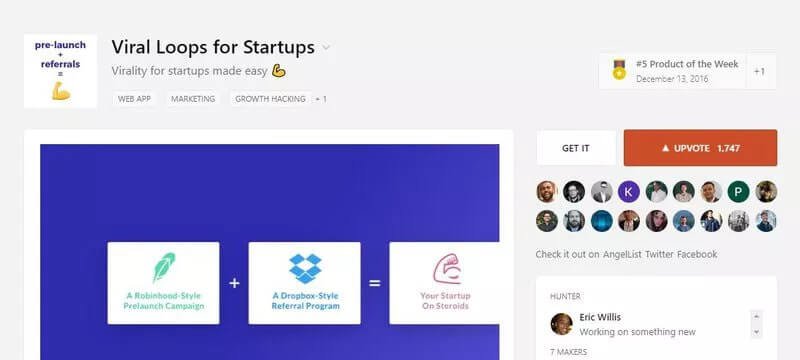
This opened the door to them becoming one of the most popular referral products on ProductHunt.
BONUS: Top eCommerce CRO Guides
Liked some of our eCommerce conversion ideas?
Here is a good list of resources to continue your learning:
1. A Complete Guide to eCommerce Conversion Optimization (DMI)
This is an oldie but a goodie. Written by the Digital Marketing Institute, it provides a thorough explanation of some of the basic elements of an e-Commerce CRO strategy, in broad strokes.
2. 13 eCommerce Conversion Examples (Optimizely)
If you’re ever interested in how conversion rate optimization started back when eCommerce just started, this is a great guide. It has some really great classic examples of checkout pages and CTA buttons.
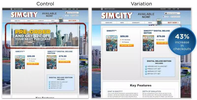
Come on, you can’t go wrong with a SimCity example from 2015:
3. 20 Reasons your eCommerce Conversion Rate is So Low (Optinmonster)
This is a great guide from Optinmonster that goes in-depth into some of the classic site improvements you could make to improve your conversion rate.
4. 17 eCommerce Conversion Hacks That’ll Double Your Conversions (Neil Patel)
Here’s a great guide by Neil Patel that brings that SEO angle into the conversation and helps bridge the gap between SEO and CRO. (Read more on eCommerce SEO companies)
5. How to Systematically Increase Conversion Rates (Convertize)
This is a great post by Convertize that introduces a lot of the research and the psychology that’s used in conversion rate optimization and provides a really great background on the science behind it. Super interesting read.
Recap
Now that you know all the fundamentals of CRO it’s time for you to go back to your site and start optimizing. Everything that we covered could be summarized into 3 steps:
- Use data to set up a good A/B test
- Use the right tools
- Pick the right CRO strategy for your site
At the end of the day, everything depends on your user data and how your customers interact with your e-commerce website and brand. So if you ever feel stuck, reach out to your customers with a quick survey and ask for feedback. Your customers are your best advocates.
And if you don’t know where to begin, we highly recommend that you check out our comprehensive CRO Audit tool to get a personalized checklist of the best changes to make for your business.
And let us know which strategies or tools you’ve been using for your CRO campaigns in the comments, we would love to hear from you! 😊