7 Best Email Capture Landing Pages in 2026
Get inspired by these email capture landing pages.
Updated March 14, 2024
Consider these email statistics:
- There are over 4 billion global email users.
- The average email open rate is 21.5%.
- Emails typically convert at 15.22%.
All of these numbers point towards why many marketers feel email is one of the best tools in their arsenal. Email marketing works. But here's the tricky part: how do you collect email addresses in the first place? Enter email capture landing pages.
Email capture landing pages are web pages specifically designed to collect email addresses from visitors.
Email capture landing pages can help you convert website visitors into potential leads or subscribers by encouraging them to provide their email addresses in exchange for something of value. This can be access to exclusive or free content, discounts, samples, competitions, and more. Below, we look at examples of the best email capture landing pages and which elements make them stand out.
7 Best Email Capture Landing Pages
- Morning Brew - Clever Copy and Compelling Offer
- Persona - Interactive Quiz for Engagement
- Hillary Weiss - Social Proof and Trust Building
- Money with Katie - Minimalist Design and High-Contrast CTA
- Mr. Draper - Personalized Recommendations
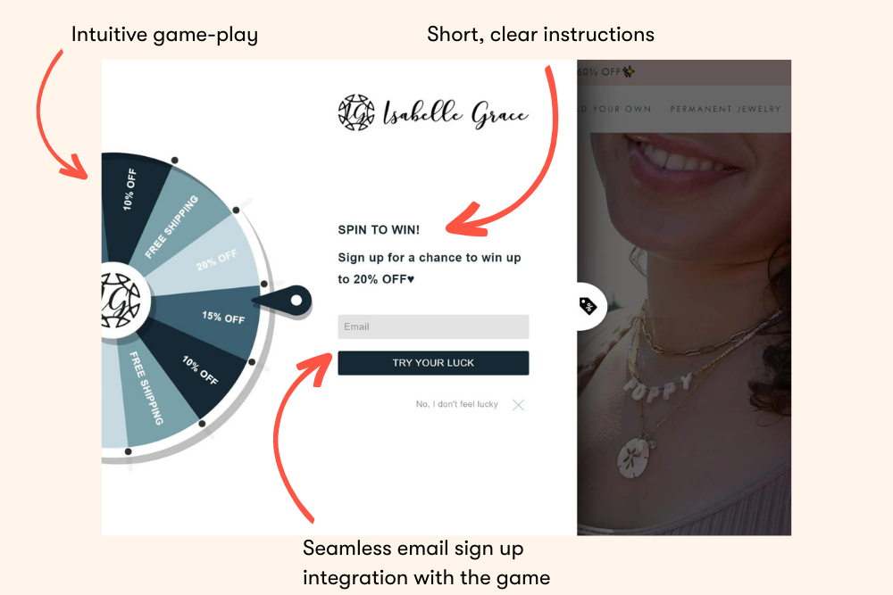
- Isabelle Grace - Gamified Opt-in Form
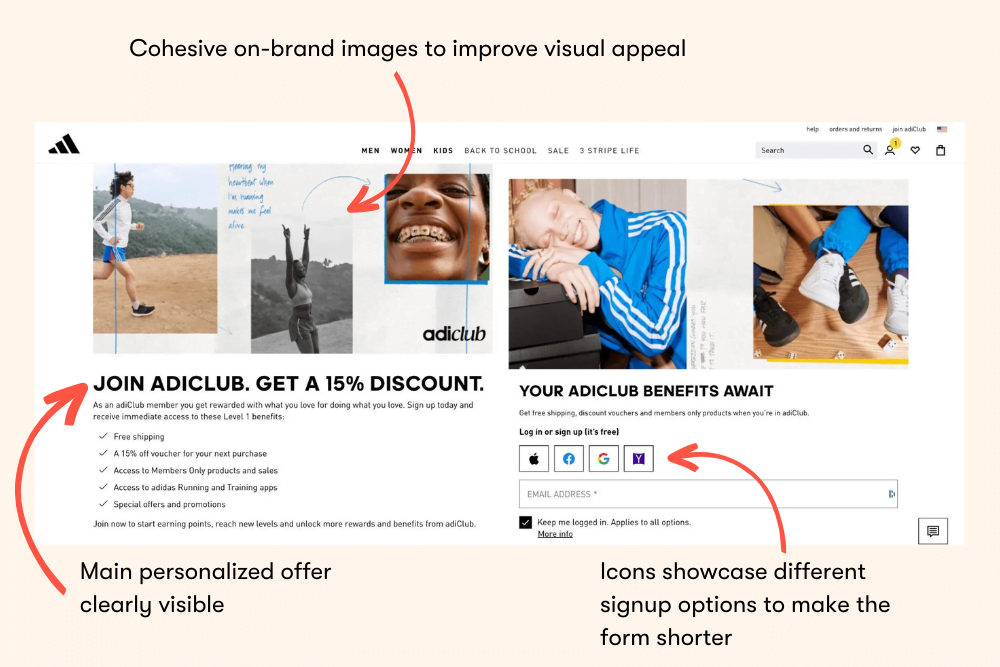
- Adidas - Dynamic Form for Reduced Friction
Landing Page #1: Morning Brew - Clever Copy and Compelling Offer
Does your copy immediately grab the users' attention? eCommerce copywriting is an art and a science: it takes a lot of skill and know-how to understand your audience and appeal to them. This means clearly communicating your value and what you can offer. Plus, it should be delivered with a design that enhances the user experience and guides them toward the call-to-action (CTA).
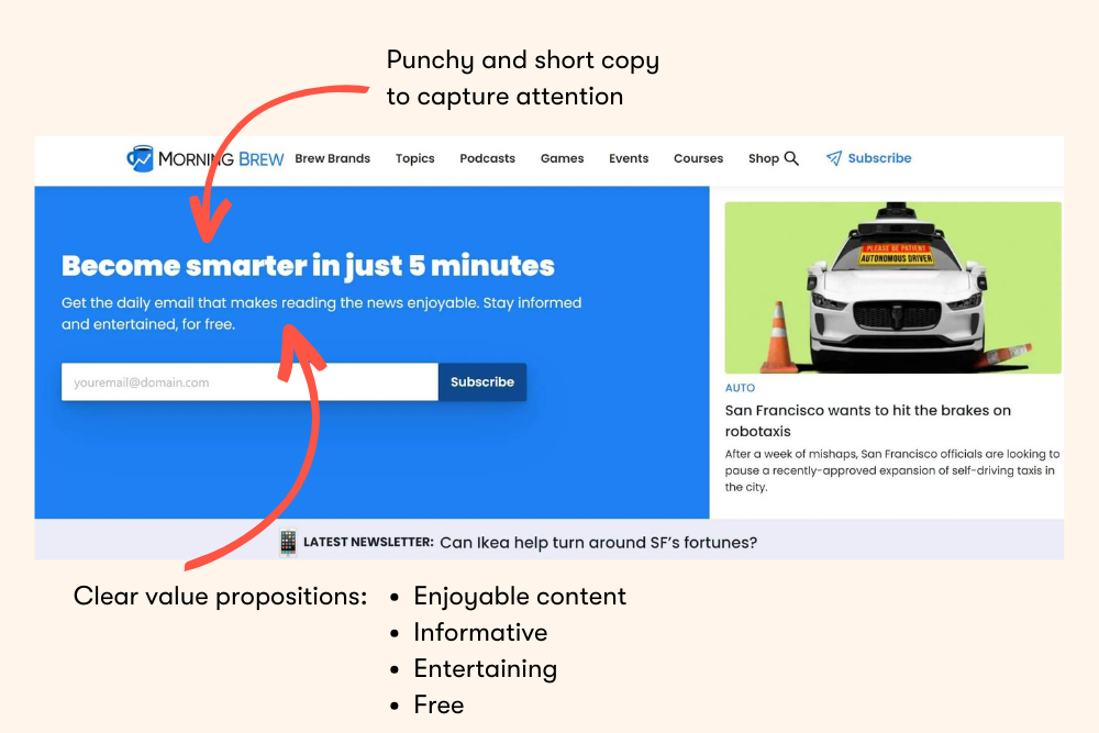
Morning Brew is short-and-sweet: a fun, tempting offer to "become smarter in 5 minutes," along with the promise that reading the news will actually be enjoyable.
Landing Page #2: Persona - Interactive Quiz for Engagement
You can make your visitors part of the process. The goal of an interactive quiz landing page is two-fold:
- It engages visitors and piques their interest in your company, what you do, and how you can help them. Plus, it can make them more willing to share their contact information.
- It helps you learn more about the visitor so you can segment your audience and conduct behavioral retargeting.
Pro tip: Apart from making the process intuitive and enjoyable, respect the visitor's privacy by explaining how their data will be used.
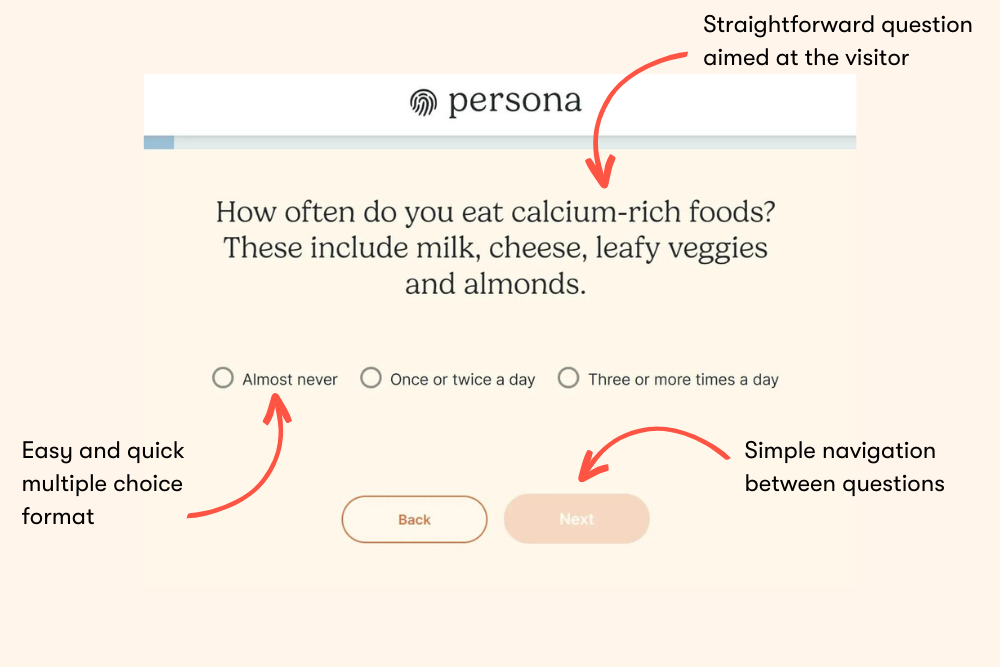
Nutrition brand Persona features an interactive quiz landing page on their website. The quiz asks nutrition-related questions, including medical history, diet, lifestyle, mental health, and health goals. At the end of the quiz, customers receive specific product recommendations and the option to make a purchase.
Landing Page #3: Hillary Weiss - Social Proof and Trust Building
Another great way to get more signups is to include social proof on your email capture landing page. It builds credibility and trust by validating your offer and demonstrating that others have had a positive experience.
This reduces potential concerns visitors may have and increases the likelihood that they'll give you their email addresses. Social proof can come in many forms, including testimonials, reviews, user-generated content (UGC), influencer endorsements, trust badges, certifications, and media mentions.
Consultant Hillary Weiss uses a combination of testimonials and media mentions to show that she really is as talented and effective as the rest of her website claims.
Landing Page #4: Money with Katie - Minimalist Design and a High-Contrast CTA
Nobody likes a complicated, confusing, cluttered landing page (or website, for that matter). A minimalist design smoothly communicates your value and guides users to take action. So, every unnecessary element is just one more thing that can get in the way. Which is why it's super important to make sure your CTA stands out.
You can also add some pop to your CTAs to lead the visitor's eye toward them and encourage them to sign up.
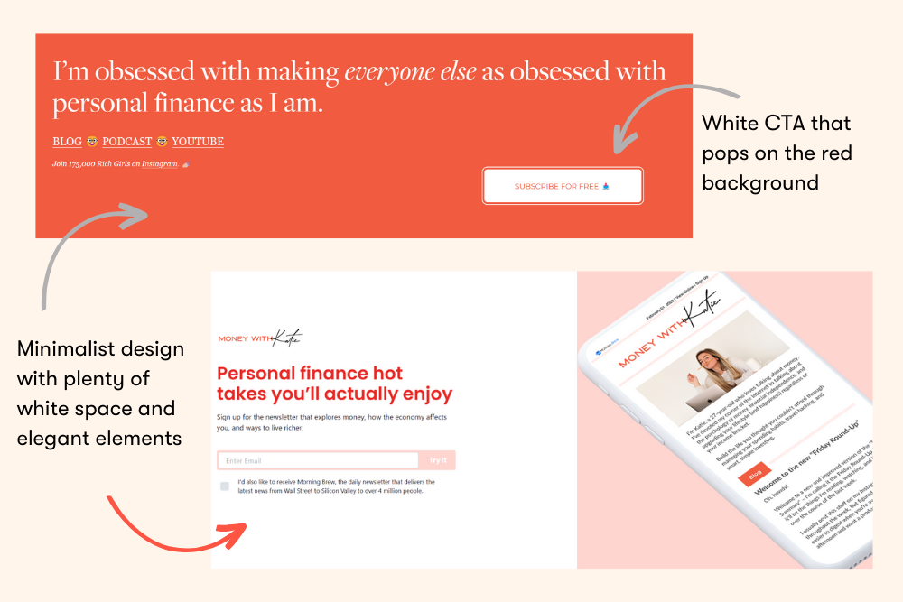
Money with Katie uses white space and a red and pink color palette to capture email addresses. In color psychology, red is a color of power and action, which can subconsciously encourage users to act by entering their email.
Landing Page #5: Mr. Draper - Personalized Recommendations
Personalization turns casual browsers into engaged consumers. Offering personalized recommendations demonstrates that you understand your visitors are individuals with unique needs—but more importantly, you can provide custom solutions that address those needs.
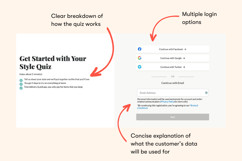
Personal shopping service Mr. Draper uses a style quiz and offers to put together outfits based on customer preferences, all while displaying an email form and social logins on its landing page.
Landing Page #6: Isabelle Grace - Gamified Opt-in Form
Gamification is when you add an interactive element to your email sign-up process. This can be a spin-the-wheel, treasure hunt, memory, or puzzle game. There's a psychological element to it: when you gamify your offer, visitors are more likely to engage out of curiosity. This extra entertainment value increases the value of your offer, leading to a potential boost in conversions.
Pro tip: Balance the level of challenge and reward to keep visitors engaged without causing frustration.
Jewelry brand Isabelle Grace uses a "spin the wheel" app to offer up to 20% off, incentivizing visitors to share their email addresses.
Landing Page #7: Adidas - Dynamic Form for Reduced Friction
Dynamic forms only display necessary fields, reducing the perceived length and complexity of your email signup form. This streamlined approach reduces friction and encourages more visitors to complete the form. Plus, dynamic forms are also well-suited to personalization because they can adapt in real time based on the visitor's behavior, responses, or past interactions.
Adidas uses location-based dynamic content on its email capture landing page. UK visitors receive a 10% discount for email sign-up, while US visitors enjoy a 15% discount.
Achieving Email Conversion Mastery
There's no single right way to craft an email capture landing page, but there are guidelines you can follow—like the tips we've just discussed. This includes clever copy to social proof to gamification. The best approach is to test different strategies and optimize your methods based on feedback. Consider reaching out to top email experts for professional guidance and give your growing email list a boost.

