The Ultimate Guide to Google Data Studio in 2026: Create Stunning Reports
Everything you need to know about Google Data Studio. How to get started, which reports to make, helpful templates and ways to improve your marketing analytics.
Published November 5, 2024
Not sure how to view all of your data in one place and don't want to pay for an expensive tool? We've all been there. Performance marketers often have this challenge.
And instead of wasting your time getting demos from fancy tools and trying to fit them into your marketing budget, what you can do is use a free tool from Google. It's called Google Data Studio, and it's what expert marketers use to create marketing reports and customizable dashboards for their clients.
In this post, we cover everything you need to know about Google Data Studio and teach you how to create your own beautiful reports from scratch to improve your marketing analytics.
Let's dive in.

What is Google Data Studio?
Google Data Studio is a web analytics platform that helps you create data-driven reports and dashboards. You can connect to multiple data sources, including Google Sheets, BigQuery, and SQL databases, and build reports with graphs, tables, and images.
Google Data Studio also lets you share your reports with others, either by exporting them as PDFs or publishing them on the web. Google Data Studio is free to use, and it's available on both desktop and mobile devices.
Google Data Studio can specifically help marketers accomplish these goals:
- Integrate a wide variety of data into a single presentation
- Visualize a range of data dynamically and creatively
- Style and brand reports meeting custom requirements
- Share data with stakeholders in a clear, compelling way
- Make presentations available anytime, anywhere
Pro tip: Need help analyzing your data and creating marketing dashboards? Check out our list of the top web analytics experts for hire.
How to Get Started with Google Data Studio
Here's a step-by-step process of creating a report with Google Data Studio.
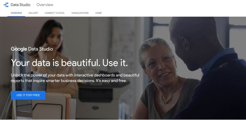
Step 1 - Sign In to Google Data Studio
The first step is to sign in to your Google account and navigate to Google Data Studio. You can sign in by visiting the Google Data Studio website and clicking on the button that says "USE IT FOR FREE".
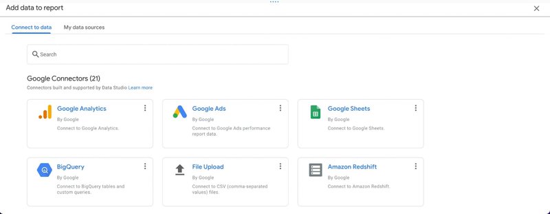
Step 2 - Connect to Your Data Sources
In order to create reports, you need to connect to your data sources. You can do this by clicking on the "Data Sources" button in the menu options and selecting integrations like Google Sheets, Google Analytics, Google Ads, Facebook Ads, YouTube, BigQuery, Google Maps, Google Docs, SQL database, and more.
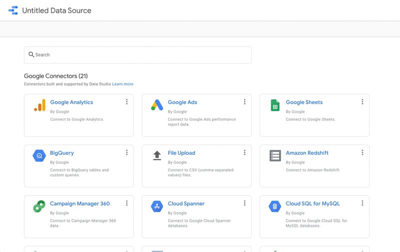
View all of the data sources available here.
Step 3 - Create a New Report
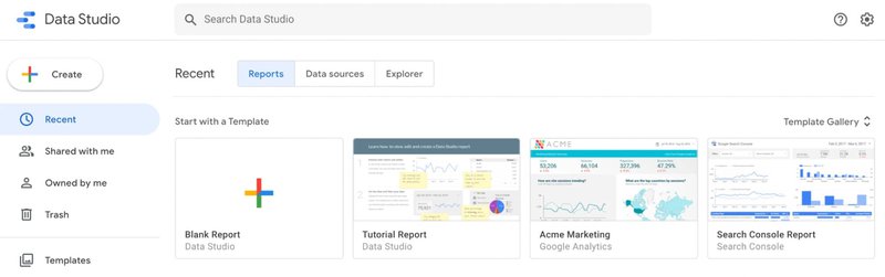
Once you have connected to your data sources, you can start creating reports. To create a new report, click on the "New Report" button in the toolbar. You can either use an existing template or create a dashboard from scratch by clicking on the "Blank Report" button.
Pro tip: your new report will show up as an "untitled report". Make sure to give it a name right away so it doesn't get lost in the shuffle.
Step 4 - Choose charts and data controls
Google Data Studio lets you choose from a number of different chart options when creating reports.
- Time series
- Basic line chart
- Bar chart
- Combo chart
- Pie chart
- Table
- Geo map
- Scorecard
- Scatter plot
- Bullet chart
- Area chart
Step 5 - Choose A Template (Optional)
If you're using a template for your report then you can find one on their list of pre-made templates. They are grouped based on the data integration you want to use.
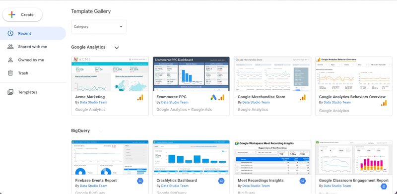
For example, if you want to create a custom Google Analytics report then you can choose from a number of these -
- An eCommerce PPC report
- Google Merchandise store report
- Google Analytics Behaviors Overview
Once you click on a template it will generate the entire report for you.
Step 6 - Add Data
To add data to your report, you need to drag and drop it from the data sources pane on the left side of the screen. You can also use filters and calculated fields to manipulate your data. They are called "Google Connectors" and there are over 20 of them.
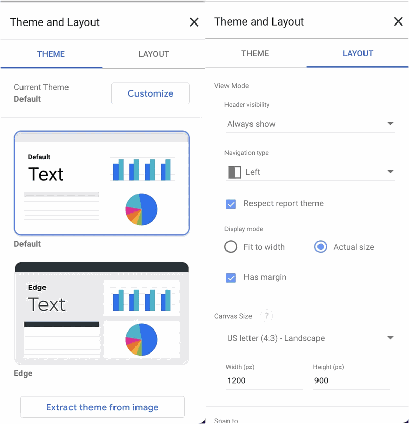
Step 7 - Format Your Data
Google Data Studio lets you format your data in a variety of ways. You can change the font, color scheme, and size of your text, as well as the border, background color, and alignment of your graphs and tables. Use the style tab on the right to control the appearance of each component of your dashboard.
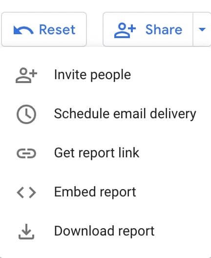
Step 8 - Share Your Report
Once you have finished creating your report, you can share it with others by exporting it as a PDF file or publishing it on the web. You can also embed your report in a website or blog post. You can find both options in the upper right-hand corner of the screen by clicking on the share button.
That's it! You now know everything you need to get started with Google Data Studio. Next, we'll highlight some of the primary benefits of using Google Data Studio and how you can use it to analyze your marketing performance.
Benefits of Using Google Data Studio
With all of the different marketing campain reporting tools out there, why use this one?
Well, using Google Data Studio for your interactive reports has a number of benefits. Here are some of the top ones.
It's free & easy to use
Google Data Studio is free to use, and you can create an unlimited number of custom reports. It's available on both desktop and mobile devices, so you can access it anywhere. You can connect to multiple data sources including all your various Google Drive apps, BigQuery, SQL databases, and more.
Google Data Studio is very easy to use. You can connect to your data sources in minutes by clicking on the "Data Sources" button in the toolbar. Create reports by clicking on the "New Report" button. You can choose from different layouts or start with a template, just add data to your report, and then format your data in a variety of ways.
It's flexible & powerful
Google Data Studio is very flexible, and you can change the font, color palette, text size, border color, background, and alignment of your graphs and tables. You can also filter and manipulate your data in a variety of ways.
It's great for displaying a single metric or data from a bunch of sources. It's easy to create interactive Google Data Studio dashboards in real time that meet your specific needs.
You can connect to a single source or multiple sources of data. There are also a bunch of advanced options if you're techy and want to work directly with the data connector code.
You can also format your data in a variety of ways and share your reports with others by exporting them as PDFs or publishing them on the web. You could also embed your Google Data Studio reports on a website or a blog post.
Pro tip: you can schedule monthly reports and have them sent to the entire team. Just put in their email addresses and click schedule.
It's updated regularly
Google Data Studio is constantly being updated, and new features are added on a regular basis. This means you can always expect to find new and improved ways to create reports and new channels to add to your list of data sources.
It's reliable & secure
Google Data Studio is a very reliable tool, and it is used by millions of people around the world. It's also backed by Google, so you can be sure that it will always be up and running when you need it.
Google Data Studio is a very secure tool, and your data is protected by Google's security measures. You can choose to password-protect your reports or keep them private so that only specific people can see them. You can also select which users have access to view or edit the reports you create.
It's easy to learn
Google Data Studio is very easy to learn, and you can create high-quality reports within minutes. The user interface is intuitive, plus the help center offers a wealth of information on how to use all of the features. You can also join the Google Data Studio community for support and suggestions from other users.
How to Use Google Data Studio to Monitor SEO Performance
Now that you know how to use Google Data Studio let's go through some ways you can use it to monitor SEO performance and key metrics. In this section, we'll show you how to use Google Data Studio to:
- Analyze your website traffic
- Track your keyword rankings
- Monitor your backlinks and anchor text distribution
- Identify new opportunities for link building
- Analyze your competitor's SEO strategies
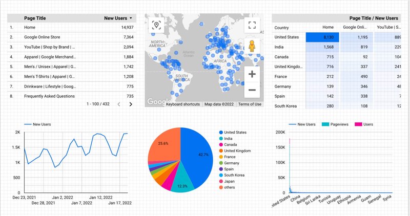
Website Traffic Analysis
One of the best ways to use Google Data Studio for SEO is to analyze your website traffic. This will help you understand where your visitors are coming from, what pages they're visiting, and how long they're staying on your site.
To do this, you'll need to connect to your website's Google Analytics and Google Search Console accounts. Once you've done that, you can create reports that show you the following:
- Total website traffic: You can see how much traffic your website is receiving overall, as well as the total number of visits, page views, and unique visitors.
- Traffic by source (e.g. organic search, social media, direct traffic): You can see where your website traffic is coming from and how much of it is organic, social, or direct.
- Traffic by medium (e.g. email, Google Google Ads, organic search): You can see the different channels that are driving traffic to your website.
- Traffic by location (country and city): You can see where your website visitors are located.
- Traffic by browser and operating system: You can see which browsers and operating systems your visitors are using.
- Pageviews by page: You can see which pages are receiving the most traffic and how that traffic is distributed.
- Average visit duration: You can see how long people are staying on your website.
- Bounce rate: You can see how many people are leaving your website after visiting only one page.
- Top pages and landing pages: You can see which pages are the most popular and which pages are serving as landing pages.
- Exit pages: You can see which pages people are leaving your website from.
- Conversion rate: You can see how many of your website visitors are converting into customers.
You can also use Google Data Studio to create funnels that show how visitors move through your website. This can help you identify any bottlenecks or areas where you're losing traffic.
To create a funnel, simply connect to your Google Analytics account and select the "Conversions" tab. Then, select "Funnel Visualization" and add the pages that you want to include in your funnel. Google Data Studio will then show you how many visitors enter and exit your funnel at each stage.
Pro tip: want help with your Google Analytics funnel vizualization? Need to create better reports? Check out our list of the top Google Analytics consultants.
Keyword Rankings Tracking
Another great way to use Google Data Studio for SEO is to track your keyword rankings. This will help you see if your SEO efforts are paying off, and it can also help you identify new opportunities for ranking improvement.
To track your keyword rankings, you'll need to connect to your Google Search Console account. Once you've done that, you can create a custom report that shows the following information:
- Your top keywords
- The position of your keywords
- The change in position for each keyword
- The average monthly search volume for each keyword
- The competition level for each keyword
- The trend for each keyword
You could also use Google Data Studio to track the rankings of your competitor's keywords. This can help you identify new opportunities for SEO and competitive analysis.
Backlink and Anchor Text Analysis
Google Data Studio can help you understand where your website's links are coming from, as well as the distribution of your anchor text. To do this, you'll need to connect to your Google Search Console account. Once you've done that, you can create a report that shows the following information:
- The number of backlinks to your website
- The distribution of backlink anchor text
- The top referring domains for your website
- The top linked pages on your website
You can also use Google Data Studio to compare the backlinks and anchor text of two different websites. This can be a great way to identify new opportunities for link building.
Competitor Analysis
Finally, Google Data Studio can also be used for competitor analysis. This can help you understand how your competitors are ranking, what keywords they're targeting, and where their links are coming from.
To do this, you'll need to connect to your Google Search Console account. Once you've done that, you can create a report that shows the following information:
- The top competing websites for each keyword
- The position of your competitor's website for each keyword
- The average monthly search volume for each competitor's keyword
- The competition level for each competitor's keyword
- The trend for each competitor's keyword
You can also use Google Data Studio to compare the backlinks and anchor text of two different competitor websites. This can help you identify new opportunities for competitive analysis.
These are just a few of the ways that you can use Google Data Studio for SEO. As you can see, this powerful tool has a lot to offer, and it's definitely worth taking the time to learn how to use it.
How to Use Google Data Studio to Measure Marketing Performance
Since you're able to connect a variety of data sources to Google Data Studio, you can also use it to measure marketing performance in Google Ads, Facebook Ads reporting, or any platform you use for online advertising.
Here are a few different ways you can use Google Data Studio to improve your advertising campaigns.
Highlight and compare key performance indicators (KPIs)
One of the key benefits of Google Data Studio is that you can quickly get access to all of your marketing data. Use scorecards to highlight your primary performance metrics with comparison data enabled to get insights quickly from an executive summary dashboard.
Blend marketing data for combined metrics calculations
Google Data Studio allows you to combine data from different sources, joined together by another variable like a date field. This enables you to blend data from multiple sources into one metric so your dashboard always displays the data you're looking for.
For marketing purposes, this feature might be useful when tracking combined advertising spend or return on ad spend (ROAS).
Observe demographic trends, geolocation trends, and cost trends
Easily observe trends in your marketing performance data without having to check multiple accounts by adding charts and graphs to your dashboard.
With advertising channels like Google Ads, you're able to measure trends in a wide array of data metrics and dimensions so that you can make more informed decisions about your advertising strategy.
See which keywords, audiences, or websites perform the best
Use the tool to segment and filter your data to get insights quickly that would otherwise be difficult to locate or convey to your clients or team members.
You can easily generate a keyword performance report using Google Data Studio (or even use the template provided by Google) to get immediate access to granular data that would otherwise take great effort to locate and compile for reporting purposes.
This can save a lot of time and also elevate insights to the stakeholders who may not have access to your advertising channels or specific knowledge about how to use them.
Key Features of Google Data Studio
Now that you know how to create reports in Google Data Studio let's take a look at some of the key features of this tool.
Templates enable you to get started quickly
One of the best things about Google Data Studio is that it comes with a number of templates you can use to get started quickly. This includes templates for creating reports on website traffic, social media metrics, email marketing performance, and more.
You can also create your own custom templates or modify the existing ones to suit your needs.
Ability to publish the report in a variety of formats
Once you've created your report, you can publish it in a number of different formats. This includes PDF, HTML, JSON, and Tableau Public. You can also share the report with others by sending them a link or embedding it on your website.
Integrations available for 150+ sources of data
Google Data Studio lets you connect to over 100 different sources of data (called data source connectors), including Google Google Ads, Google Analytics, Facebook Ads, Twitter, and so much more. This gives you the flexibility to create reports on any aspect of your business's performance.
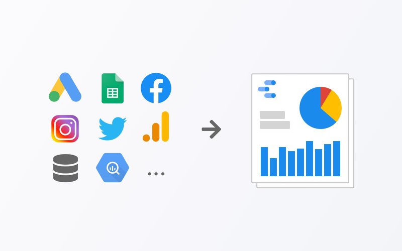
You can also combine data from multiple sources into a single report for mixed reporting or blended reporting. For example, you could track website traffic and conversions from Google Analytics and Facebook Ads in the same report.
Ability to design your own theme
Google Data Studio lets you customize your own report theme, which controls the look and feel of your reports. This includes the colors, fonts, and logos that are displayed in the reports.
You can also share your report themes with others or use them as a starting point for creating your own custom themes. To do so, click on the "Themes" tab in the report editor and then click on the "Create new theme" button. That way you don't have to start each report from scratch.
Embedding external content
Google Data Studio lets you embed external content in your reports, including videos, images, and maps. This gives you the ability to add richer data visualizations to your reports and make them more engaging for your audience.
To do so, click on the "Add element" button in the report editor and then select "Embed content". You can then choose the type of content you want to embed.
Scheduling reports to your team and stakeholders
Google Data Studio lets you send scheduled reports to yourself and others, which means the recipients will automatically get a copy of the report delivered on a specified time and date. This is a great way to ensure that everyone in your organization has access to up-to-date data.
To do so, click on the "Settings" tab in the report editor and then click on the "Schedule report" button. You can then specify when you want the report to be sent and who you want it to be sent to.
Export reports as CSV files
Google Data Studio lets you download reports as CSV files, which makes it easy to import the data into other applications for further analysis. To do this, just click on the "File" menu toggle in the report editor and then select "Download As." You can then choose the type of file you want to download.
Embed reports on your website
Google Data Studio lets you embed reports on your website, which makes it easy for your audience to access and view the data.
To do so, click on the "Settings" tab in the report editor and then click on the "Embed report" button. You can then choose the size and location of the embedded report.
Add a date range filter
Google Data Studio lets you add a date range filter to your reports, which makes it easy for your audience to view the data over a specific time period.
To do so, click on the "Filters" tab in the report editor and then select "Date range". You can then choose the start and end dates for the data you want to display. You can also change the "default date range" of each property or for the entire report.
Add filter controls
Google Data Studio lets you add filter controls to your reports, which makes it easy for your audience to view the data over a specific time period.
To do so, click on the "Filters" tab in the report editor and then select "Filter controls". You can then choose the fields you want to display as filters.
Create interactive chart filters
Google Data Studio lets you create interactive chart filters, which makes it easy for your audience to filter the data by specific criteria.
To do so, click on the "Filters" tab in the report editor and then select "Interactive chart filters". You can then choose the fields you want to display as filters.
Group data by column
Google Data Studio lets you group data by column, which makes it easy for your audience to compare and contrast the data.
To do so, click on the "Group" button in the report editor and then select "Columns". You can then choose the fields you want to group by.
Create custom calculated fields
Google Data Studio lets you create custom calculated fields, which means you can add your own calculations to the data.
To do so, click on the "Calculated Fields" tab in the report editor and then select "Create new field". You can then enter the name of the field and the calculation you want to use.
Pro tip: you can transform, categorize, and do math with your data by creating a calculated field. It's like a formula that you set to do an action with your data, like adding two data points together. Adding calculated fields can help you make your data more useful to your stakeholders.
Add notes to your dashboard
Google Data Studio lets you add notes to reports, which makes it easy for your audience to understand the data.
To do so, click on the "Notes" tab in the report editor and then enter the text you want to include. You can also format the text using Markdown.
Add a table of contents
Google Data Studio lets you add a table of contents to reports, which makes it easy for your audience to navigate the data.
To do so, click on the "Settings" tab in the report editor and then select "Table of contents". You can then choose the fields you want to include in the table of contents.
Add data control widgets
Google Data Studio lets you add data control widgets to reports, which makes it easy for your audience to filter the data by specific criteria. To do so, click on the "Widgets" tab in the report editor and then select "Data control". You can then choose the fields you want to display as filters.
For instance, you might want to compare data from a specific time period or see how one metric changes when another is tweaked. But you can also use it as a way to show off your skills by filtering the data in creative ways.
Add a dimension breakdown widget
Google Data Studio lets you add a dimension breakdown widget to reports, which makes it easy for your audience to compare and contrast the data. You can use this feature to compare data by different dimensions, such as country, region, or city.
To add a dimension breakdown widget to your report, click on the "Data" tab in the report editor and then select "Dimension breakdown". You can then choose the fields you want to include in the widget.
Create report-level filters
Google Data Studio lets you create report-level filters, which makes it easy for your audience to filter the data by specific criteria. This helps you to focus on the data that is most important to your audience.
Create blended fields
Google Data Studio lets you create blended fields, which makes it easy for your audience to compare and contrast the data. This is especially useful for analyzing data over time with your combined marketing channels.
Final Thoughts
Google Data Studio is a powerful data analysis and visualization tool that lets you create a variety of different types of reports. It's very easy to use and provides a wealth of features that let you analyze your data in new and interesting ways.
Before you start using Google Data Studio, make sure that you understand the type of data you want to analyze and the type of reports you want to create. Also, make sure that your audience can view your reports on the devices they use most often.
So, what are you waiting for?
Start using Google Data Studio today!